Col•or
/kələr/
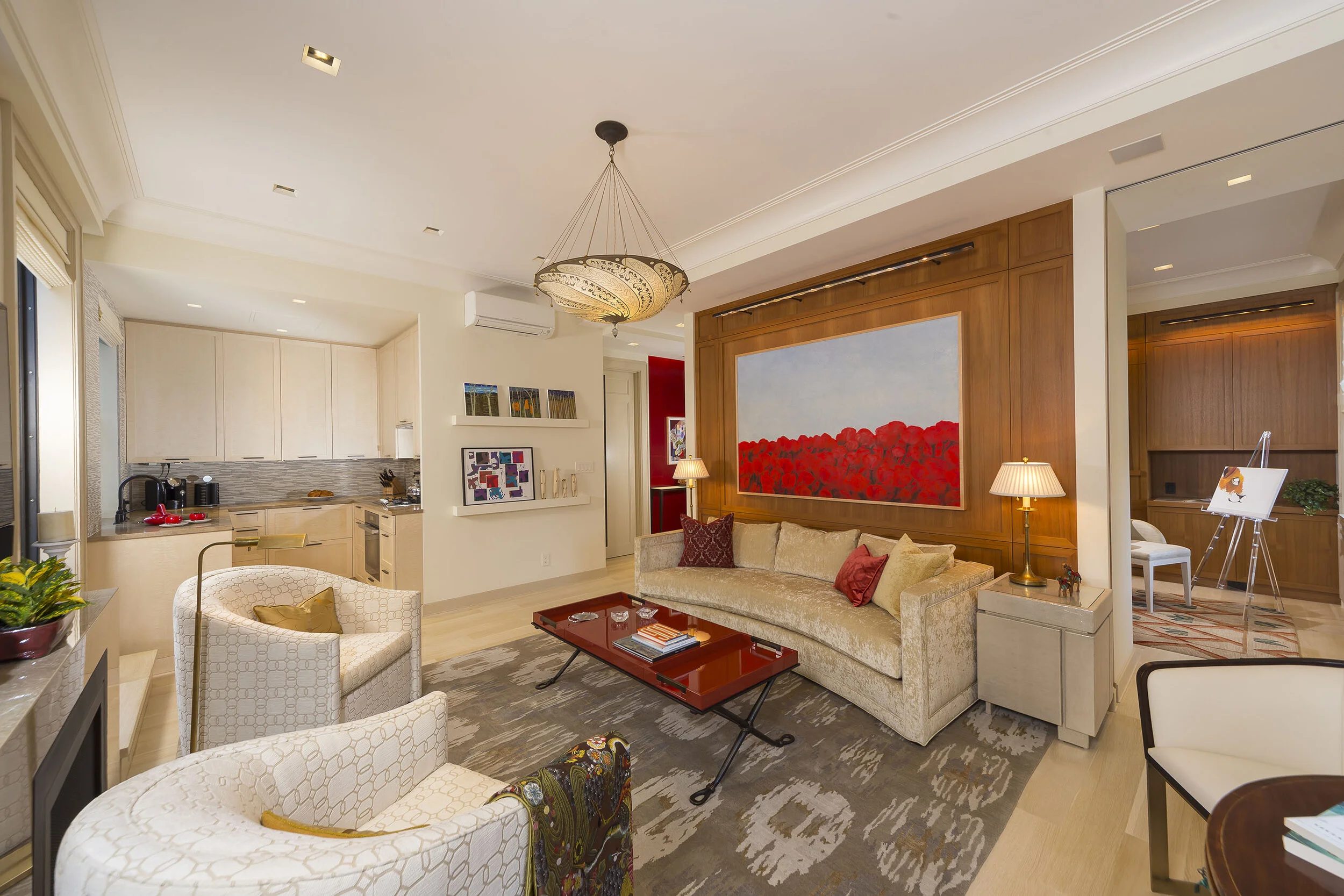
Color encompasses every aspect of our lives. It can affect our emotions and senses, holds cultural symbols and meanings, and can be a powerful communication tool.
Color is on every thing!
From the clothes we wear to the food we eat to the spaces we inhabit. It is already known that the easiest way to give any space or item a face-lift is with paint (ie: color) no matter the hue. The color choices we make “reflect a deeper meaning about our personality traits” and “every color carries a vibration”.
The way we use it can affect our lives.
WARM COLORS
Yellow, Orange, and Red are seen as energizing, passionate, and positive hues. They make people happy and enthusiastic.
Yellow fosters optimism thanks to sunshine and sunflowers. Used in entryways for a nice surprise upon entering or as accents throughout a space for an eye-catching pop of color.
Orange is a color that helps with creativity and energy; great for office spaces and kid playrooms.
In some cultures, red is the color for success and good fortune. Caliente, a fiery red, was Benjamin Moore’s 2018 Color of the Year.
COOL COLORS
Green, Blue, and Purple are seen as calming, relaxing, and reserved colors.
Green symbolizes wealth, growth, and nature. Farrow and Ball’s resident color creator is showcasing green hues in 2020 to help create spaces that are warm, comforting, and grounding with their Duck Green and Sap Green paint colors.
Blue has been culturally used to represent peace, holiness, and royalty. Both Pantone and Sherwin Williams have chosen a blue for their 2020 Color of the Year. Pantone’s Classic Blue, “a familiar, calming shade of azure” and Sherwin Williams’ Naval being a deep, classic navy. I’d say both seemingly appropriate colors for our current times.
Purple inspires spiritualism, is magical, and gives a sense of luxury.
NEUTRALS
We cannot forget about our neutral hues ranging from White to Black.
White and Cream give a sense of purity and cleanliness. Its versatility in sleek and modern design to cozy Danish and Scandinavian interiors make it a goes to color for creating a sense of calm and order.
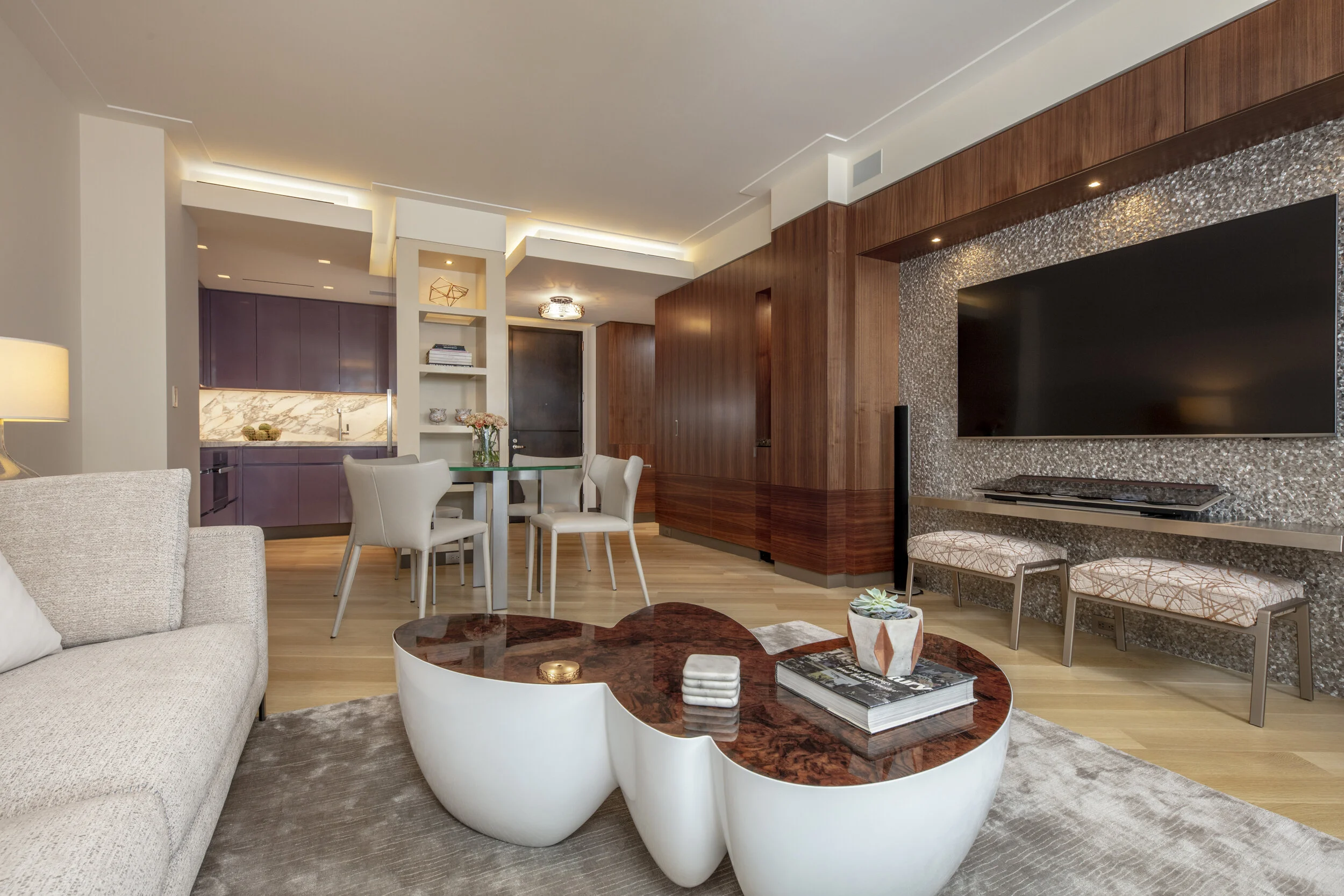
Beige and Brown are conservative and wholesome. Beige was the go-to color for interiors in the ’90s to early 2000s. Providing a great backdrop for every design aesthetic.
Black and Grey are considered moody, mysterious, and/or elegant. These hues have really made a statement for the past 10 years. Grey especially has made a splash onto every surface of our homes ranging from walls to cabinetry, furniture, stone, and tile, fabrics, etc. Last year’s Benjamin Moore Color of the Year, Metropolitan AF-690, is a soft grey said to provide effortless beauty and sophistication.
Color is an integral part of our environment and color consultations are a great way to identify potential hues to try out in your home. Choosing the color that matches your personality and style will not only enhance your interiors but your life as well.
Let me help you select new colors for your space with a one-on-one Color Consultation!
- Cynthia
“The best rooms have something to say about the people who live in them”


